Taxi fare model
Estimating what a New York taxi will cost before you get in, knowing only where it starts, where it ends and what time it is. A multiple linear regression model that explains 87% of the variation in fares with a mean error of $2.16.
- Role
- Analysis and modelling, individual work
- Context
- Capstone · Google Advanced Data Analytics
- Data
- 22,699 trips · NYC TLC, 2017
- Tools
- Python, pandas, statsmodels, scikit-learn
The problem
New York's Taxi and Limousine Commission wanted to show riders an estimated fare before the trip. The catch is in the data: the two variables that best explain a fare — distance and duration — only exist once the trip is over. A model trained on them looks excellent in a notebook and is useless in production.
How I approached it
I followed the programme's PACE framework — plan, analyse, construct, execute — and recorded each decision in a separate strategy document.
- Exploration of 18 columns: duplicates, nulls, types and impossible values
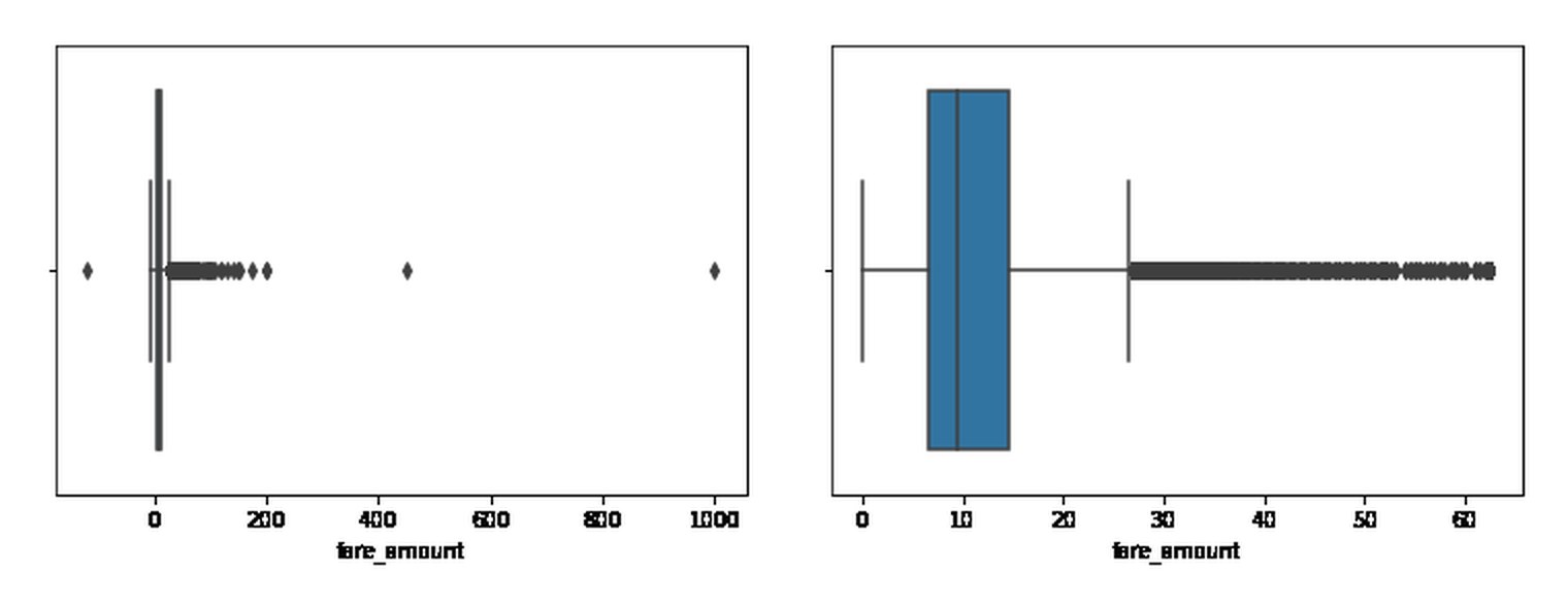
- Negative durations and fares set to zero; extreme values capped at Q3 + 6·IQR
- New features that are knowable before the trip: mean distance and duration for each pickup–dropoff pair (4,172 pairs) and a rush-hour flag
- Categorical encoding, standardisation and a 70/30 train/test split
- Ordinary least squares regression with statsmodels, evaluated with R², MAE and RMSE on both sets
The decision that defines the model
Instead of the trip's actual distance, the model uses the historical mean distance and duration of that same route. The system already has that information when the rider requests a cab, so the model can actually be used. It gives up some accuracy compared with the real trip data, and in return produces an estimate that can be shown before the trip begins.
Results
- Test R²
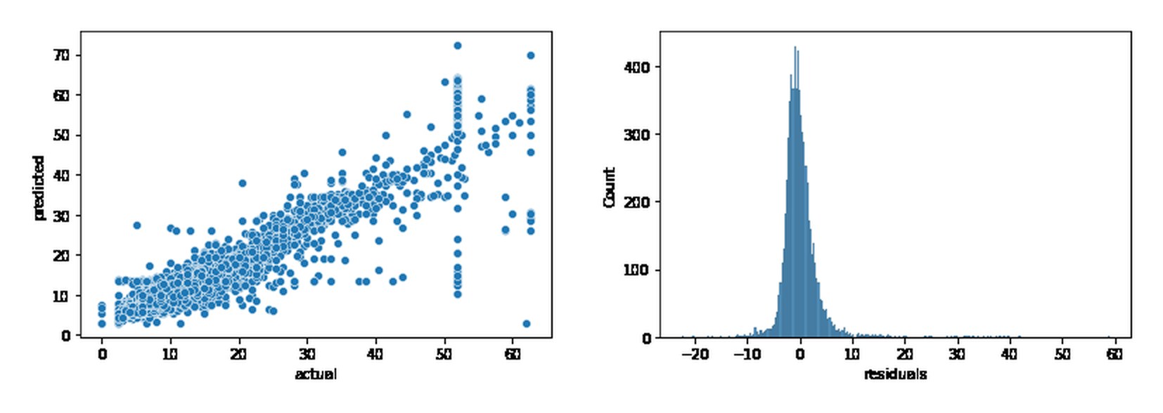
- 0.874
- Mean absolute error
- $2.16
- RMSE
- $3.67
- Training R²
- 0.870
Test performance matches training performance, so the model is not overfitting. Among the continuous variables, the route's mean distance carries the most weight: one additional standard deviation adds about $5.90 to the fare, against $3.40 for mean duration. Rush hour barely moves the estimate.
What I found in the data
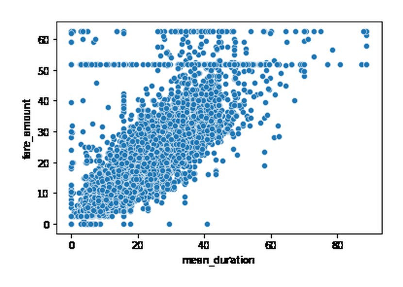
Plotting duration against fare revealed a perfectly horizontal line at $52: many trips of very different lengths at exactly the same price. It is the flat fare between JFK airport and Manhattan. The model absorbs it through the rate code, which turned out to be the variable with the largest effect on price.
What I would change
Mean distance and mean duration are highly correlated with each other, which makes their coefficients unstable even though it does not hurt prediction. I would check the variance inflation factor and keep only one of them if the goal were interpretation. And I would compute the route averages on the training set only: computing them over all the data lets information from the test set leak into the model.
Deliverables
View the notebook Notebook · .ipynb Executive summary · .pptx PACE strategy · .docx Certificate GitHub repository
Capstone project for Regression Analysis: Simplify Complex Data Relationships, part of the Google Advanced Data Analytics programme on Coursera. Automatidata is the case study's fictional consultancy; the data is a public sample of 2017 New York yellow-cab trips.